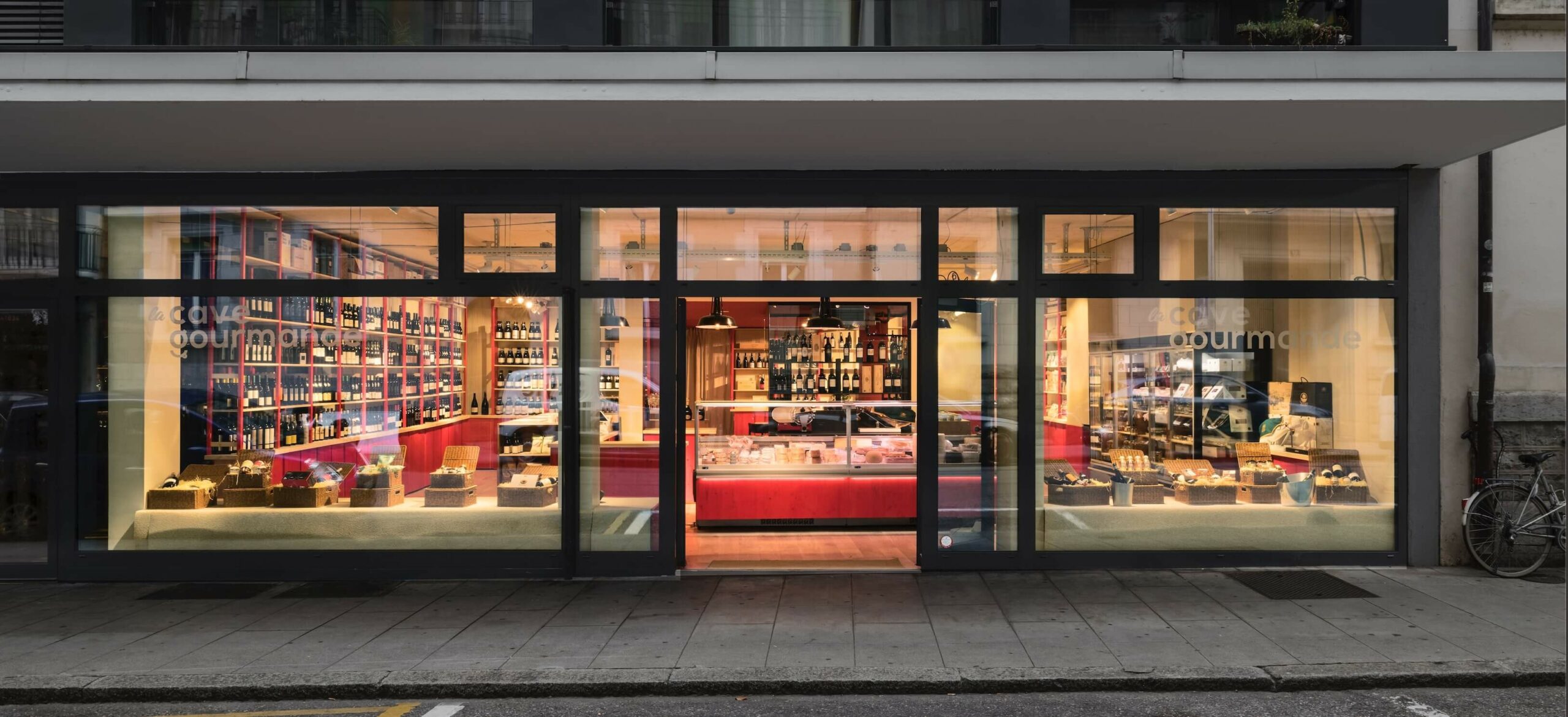
La Cave Gourmande
Type Retail Architecture
Client La Cave Gourmande
Location Geneva, Switzerland
Photos by G. Formentini
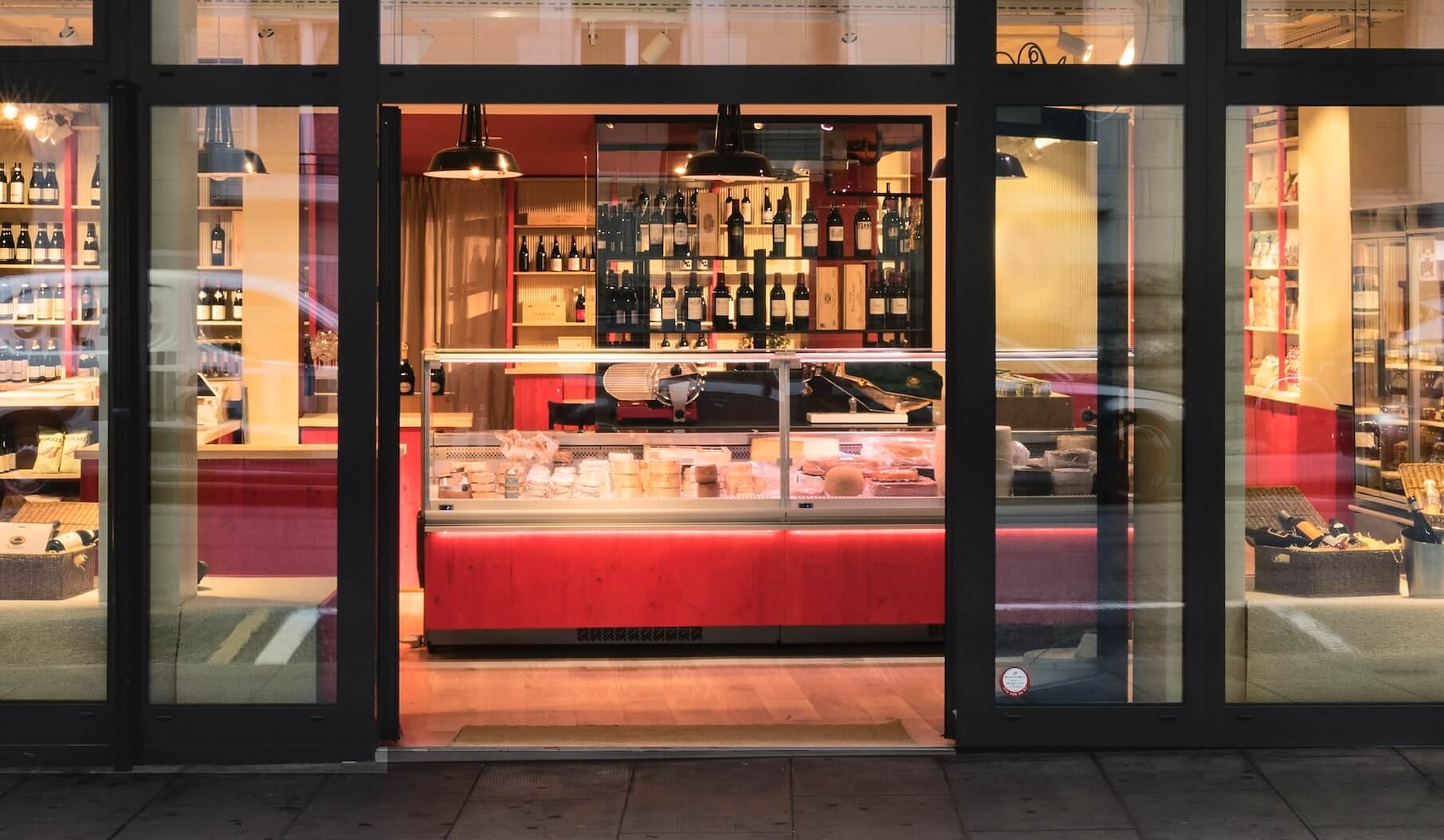
The interior design of the grocery shop, La Cave Gourmande in Geneva, is designed to provide the best customer experience. From the very moment you walk in, clients see all the products. The architectural promenade drives buyers trough each section of the store. Leaving no product unseen.
Located in the center of the lively Eaux-vives neighbourhood in Geneva, the grocery shop is on a road which ends onto the lake Leman and the iconic water fountain. The strong identity of the store is given by the two tones, red and beige, used in the design. The choice of the materials provides a luxury feeling to the goods. Combined with the high-end details of the furniture the overall retail architecture stands out.
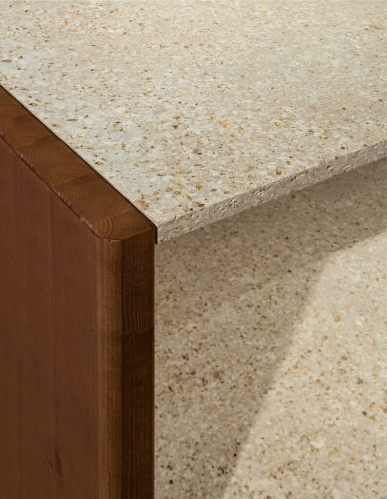
Noble Materials and Simple Details
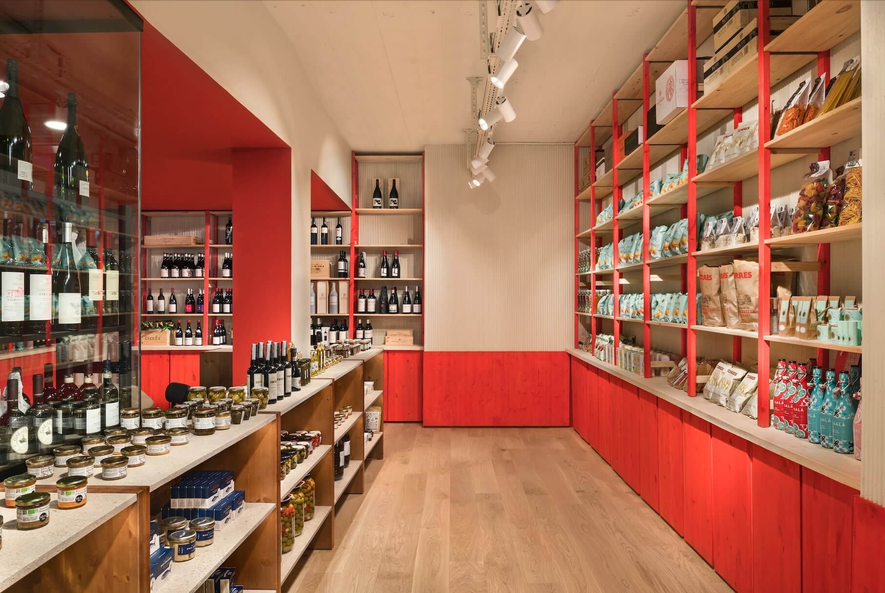
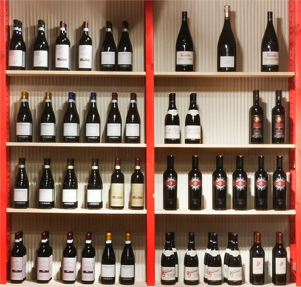
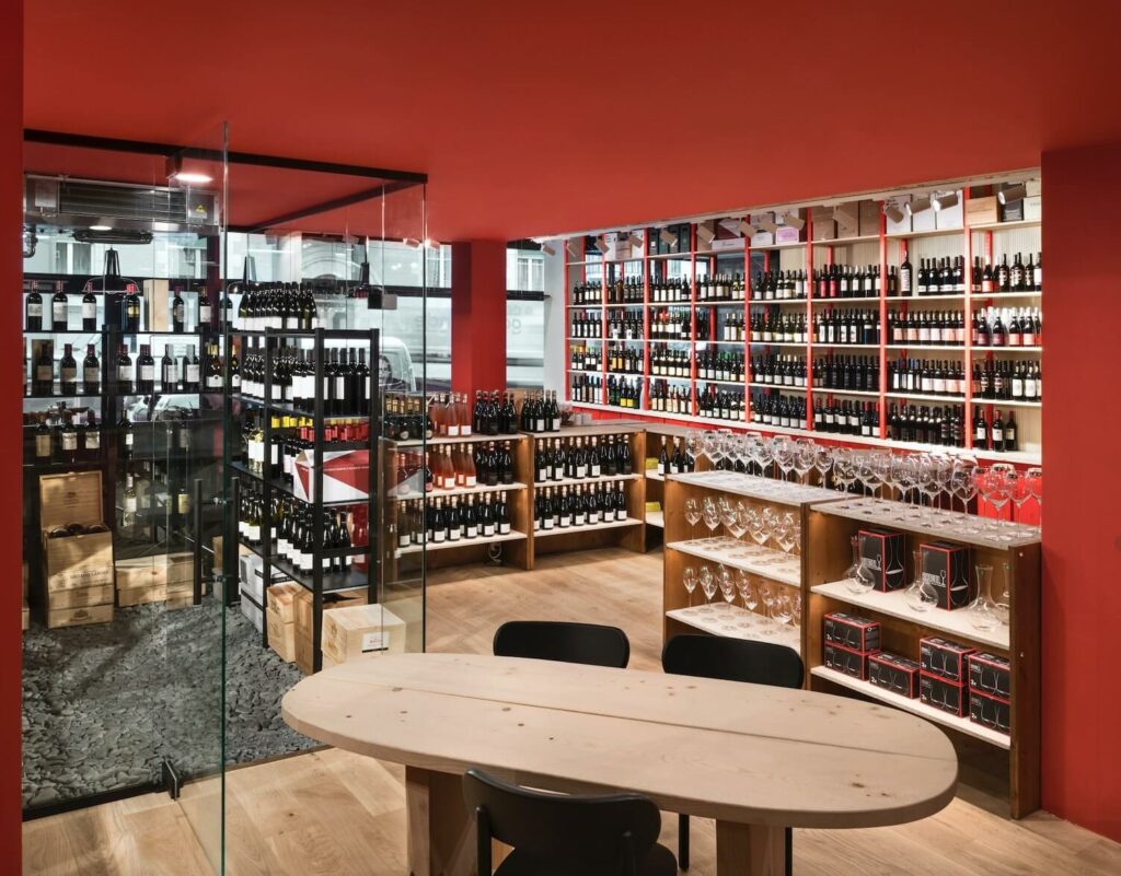
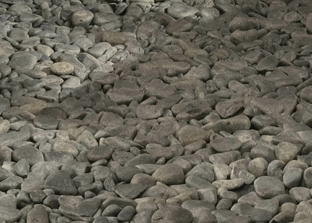
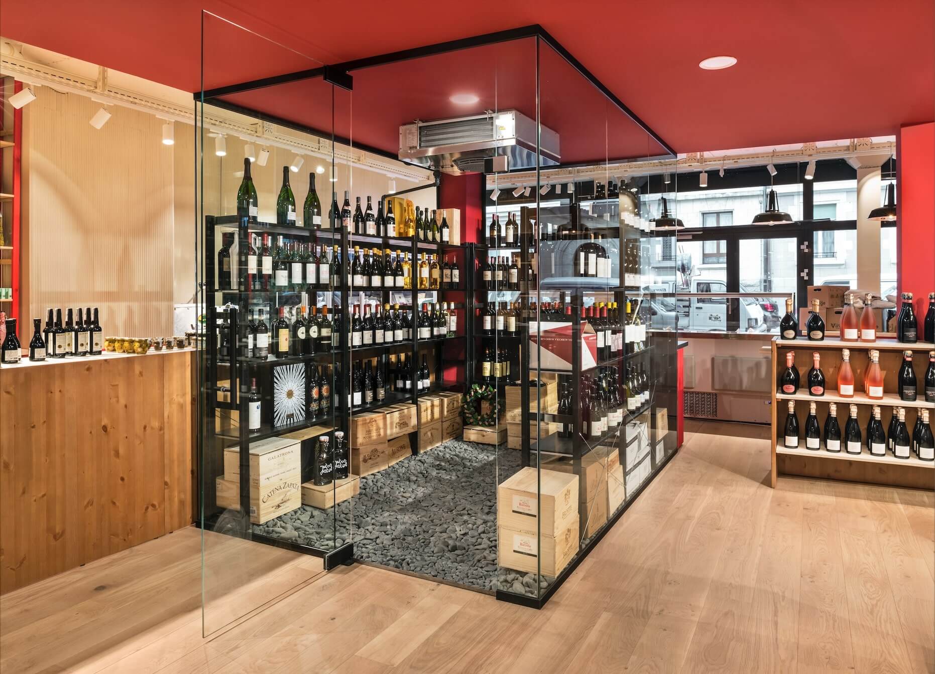
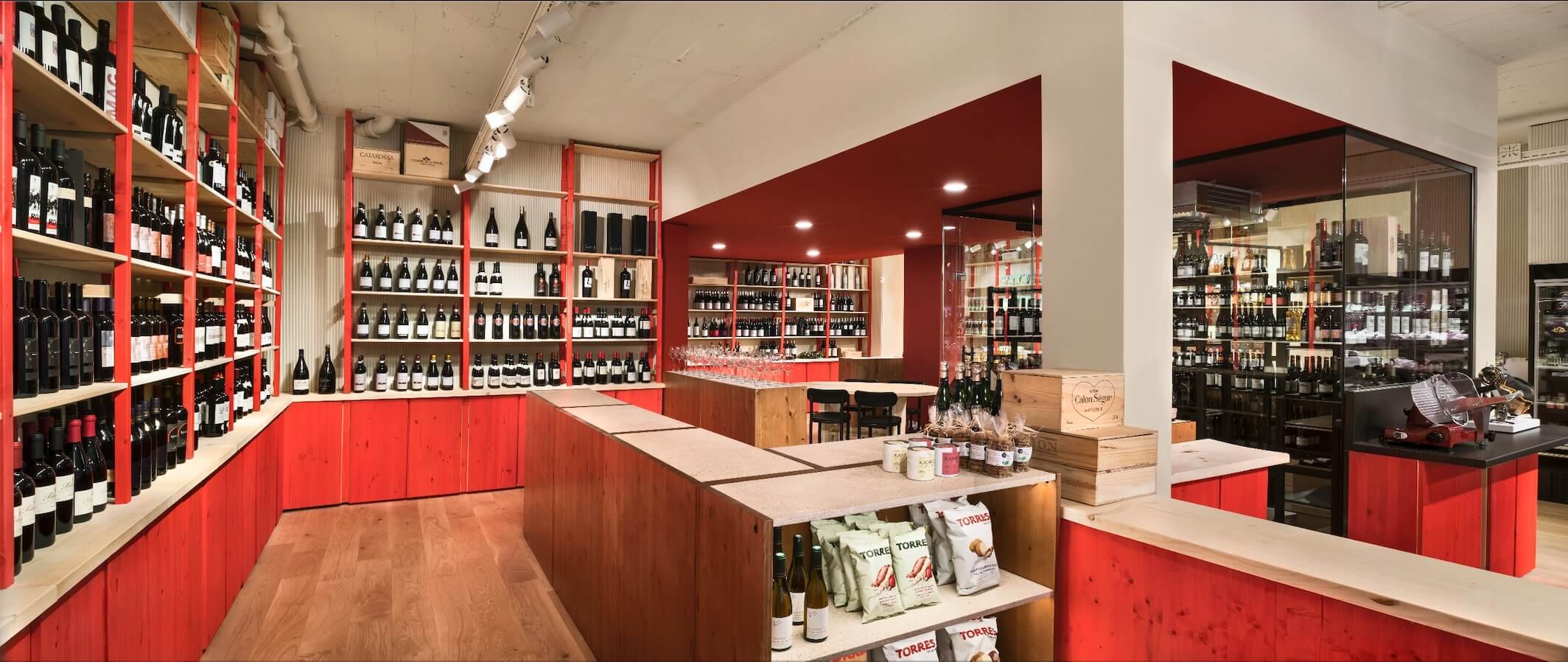
All materials used are noble. Low shelfs are made out of hazelnut wood and natural stone; wall shelves and cabinets use solide red pine wood; all the work surfaces including the round table use 100% Swiss made solid wood which was treated to keep its light tone; the dark pebble in the cellar are in fact black marble; the floor is covered with French centenary oak parquet; each wall is adorned wit thousands of beige painted triangular sticks, conferring to the space a deepness. No detail was left aside.
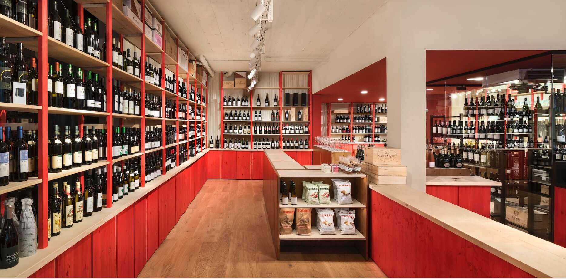
The promenade architectural is fundamental for the retail design
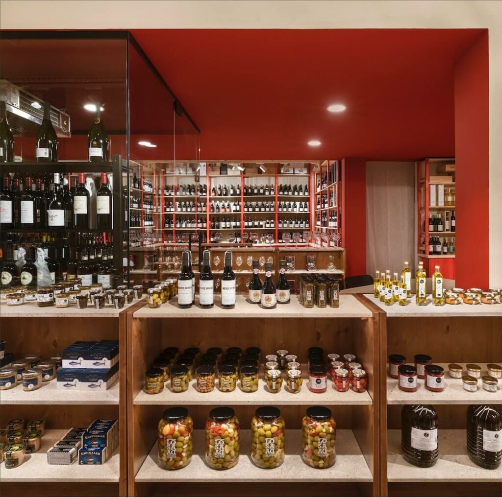
At the entrance stand two huge fridges counters which keep cheeses and delicatessens fresh. An open corridor leads to the grocery shelves, passing by the windows of the wine cellar. In the center a simple wooden table invites you to sit and taste selected products. Behind, like a diamond I, stands the heart of the shop: the full glass cellar keeps the rare bottle at the right temperature. The wine collection goes up to the ceiling gathering hundreds of references. At the end of an other open corridor, covered with a Persian carpet, lies an invisible checkout awaits on a a solid pine wood counter.
Integrating Hospitality Operations into Retail Architecture
When designing a shop or any retail experience, a good design is not sufficient. Retail architecture has to aim for efficiency, effortless interactions, ease of movements, thoughtless flow and productive operations. Too often design stands out and becomes a burden to the final purpose. Cosmetics are overly important, but they have to bend to the concept and adapt to the use.
The retail architecture has a design which is sooth. It has to remain unnoticed to enhance the customer experience. The design of the floor plan and the distribution allow an easy approach of the client to all products.
The hospitality operations are key, they consolidate the retail architecture design of the store. Independently from the clients’ path sales assistants or seller are able to overview and access all spaces of the shop at any moment. Integration architecture and hospitality are fundamental to reach an effective contemporary design.
Retail Architecture and fridge counter distribution.
The tree fridges are crucial to the retail architecture. The huge cold counter showcases the cheese, pâté, oven dishes and caviar. When the customer enters the store, its first impression will be given by this counter and the glass whine cellar in the background. Directly to the right the tree meter long cabinet fridge displays cold meet, delicatessen and charcuterie.
Each customer walks along the deli counter having a glanceat at the meat. The glass wine cellar placed in the center of the store has a footprint of 10m2. It keeps the grand cru at the perfect temperature and the white wines ready to be picked. The position of each fridge is heavily considered to serve the architectural distribution of the floor plan.
