VORTEX canteen Restaurant
Type Hospitality Architecture
Client Fairflex SA
Location EPFL – UNIL, Lausanne, Switzerland
Photos by G. Formentini
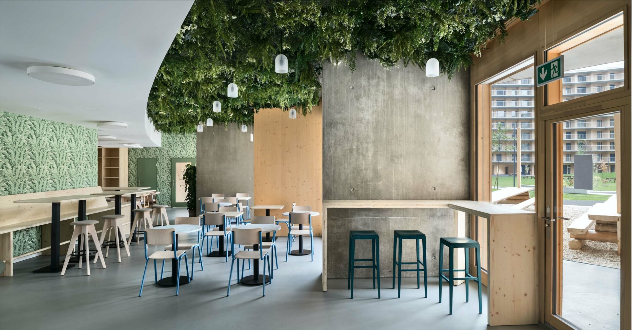
The Vortex restaurant is an architecture design which integrates hospitality and operation with the customer experience. It is located in a student housing building. The floor plan of the restaurant without the kitchen has a surface of 250m2. Used as a canteen by the students and people at the university, the design generates a Nordic atmosphere. The cold light combined with the green wallpaper and the ceiling covered with plants unite to create a convivial ambience.
The combination of the materials is adapted to the university environment. The made to measure furniture is designed to be simple and noble but not luxurious. The resonance between the colors is subtle. The architecture floor plan is designed to maximize the flow of students and ease the customer experience.
Following the clients wish, the Canteen of the Vortex restaurant, has a Nordic Design.
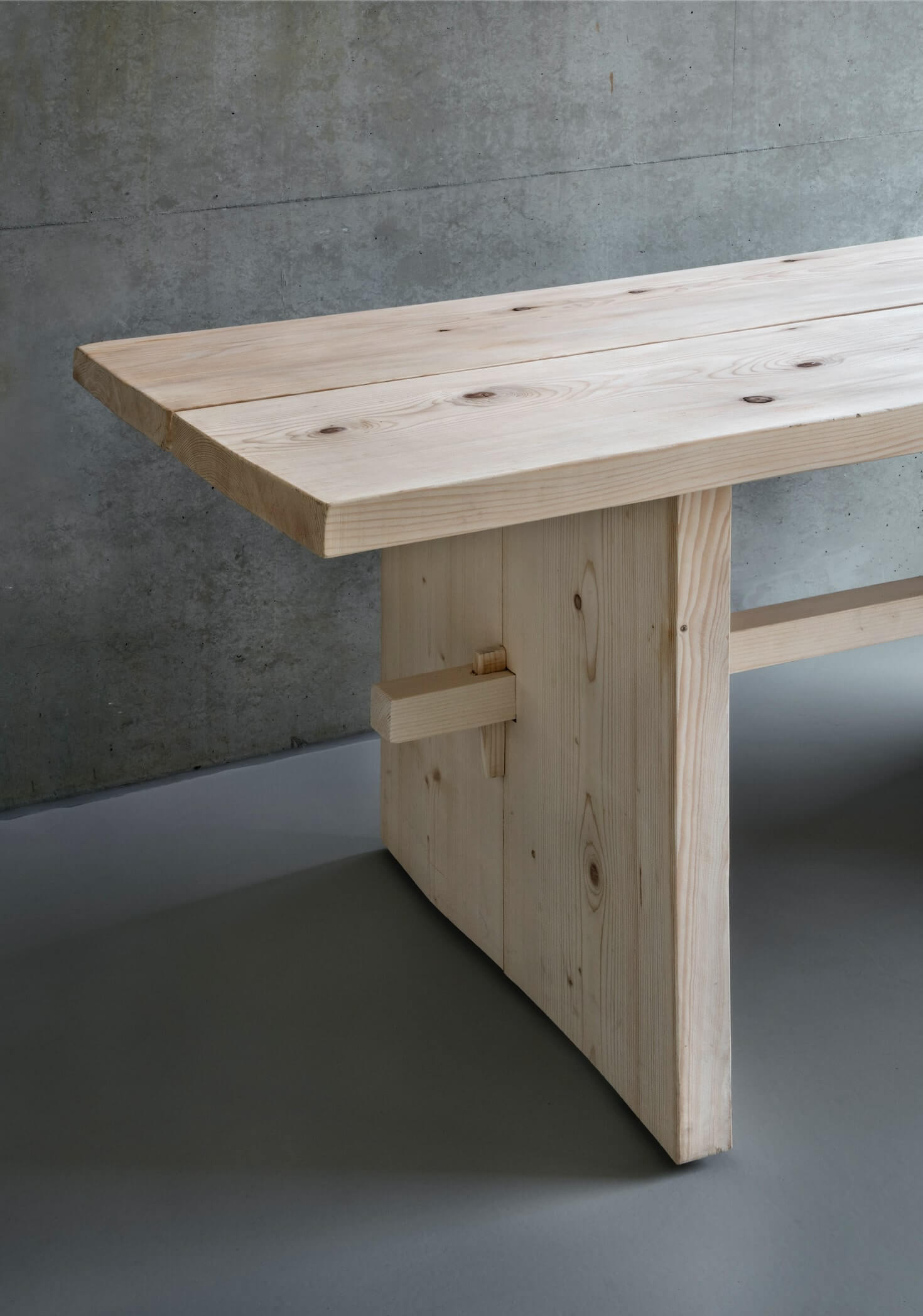
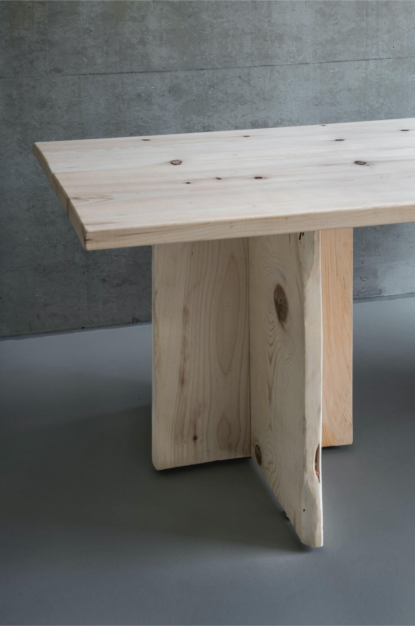
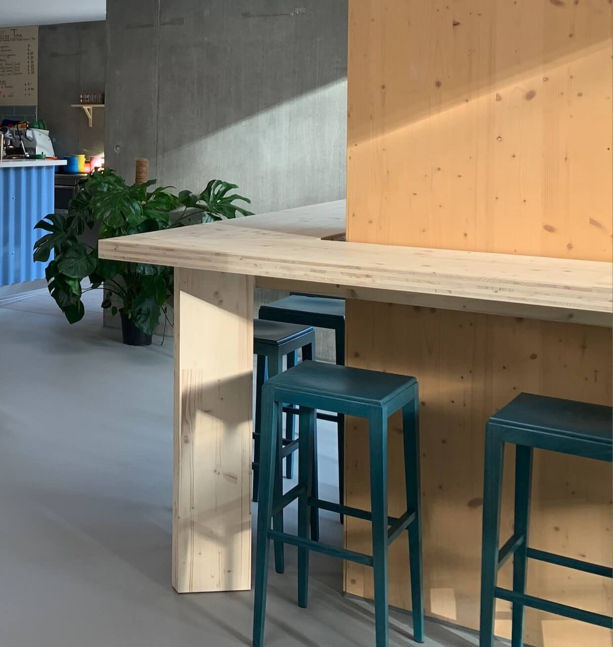
All the furniture: the tables; the chairs; the cabinet are reduced to their essence. Nothing is superfluous. The wood used for most of the tables, the bench and the counter are not solid wood but composite. Meanwhile the Farmer’s Table and the main bar worktop use solid wood. A light tone was chosen to keep the aspect of freshly cute lumber.
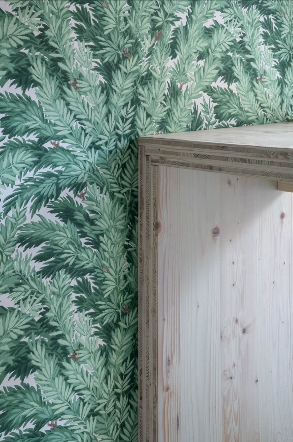
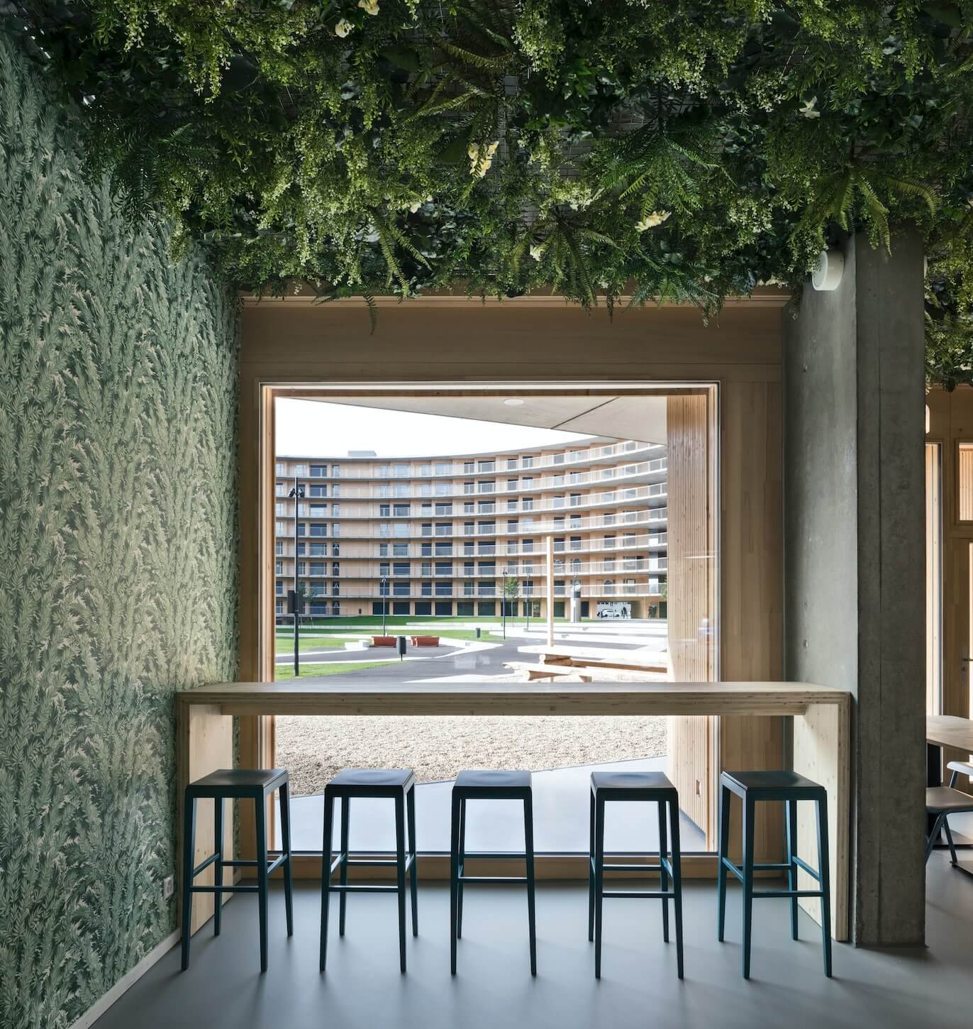
As a remembrance of the nearby nature, part of the double height ceiling is covered with plants. More than seven different species where heterogeneously hung to recreate an organic atmosphere. All the plain walls are covered with an Art and Craft Wallpaper featuring leaves. The opposition between the 19th century illustration and the contemporary architecture enhances the warm atmosphere of belonging and well-being.
Design every detail
The homogenous hospitality gesture is achieved by integration every detail into the concept. Operations, lighting, furniture, design, architecture,…, all work together to build the best customer experience without compromising the hospitality work flow.
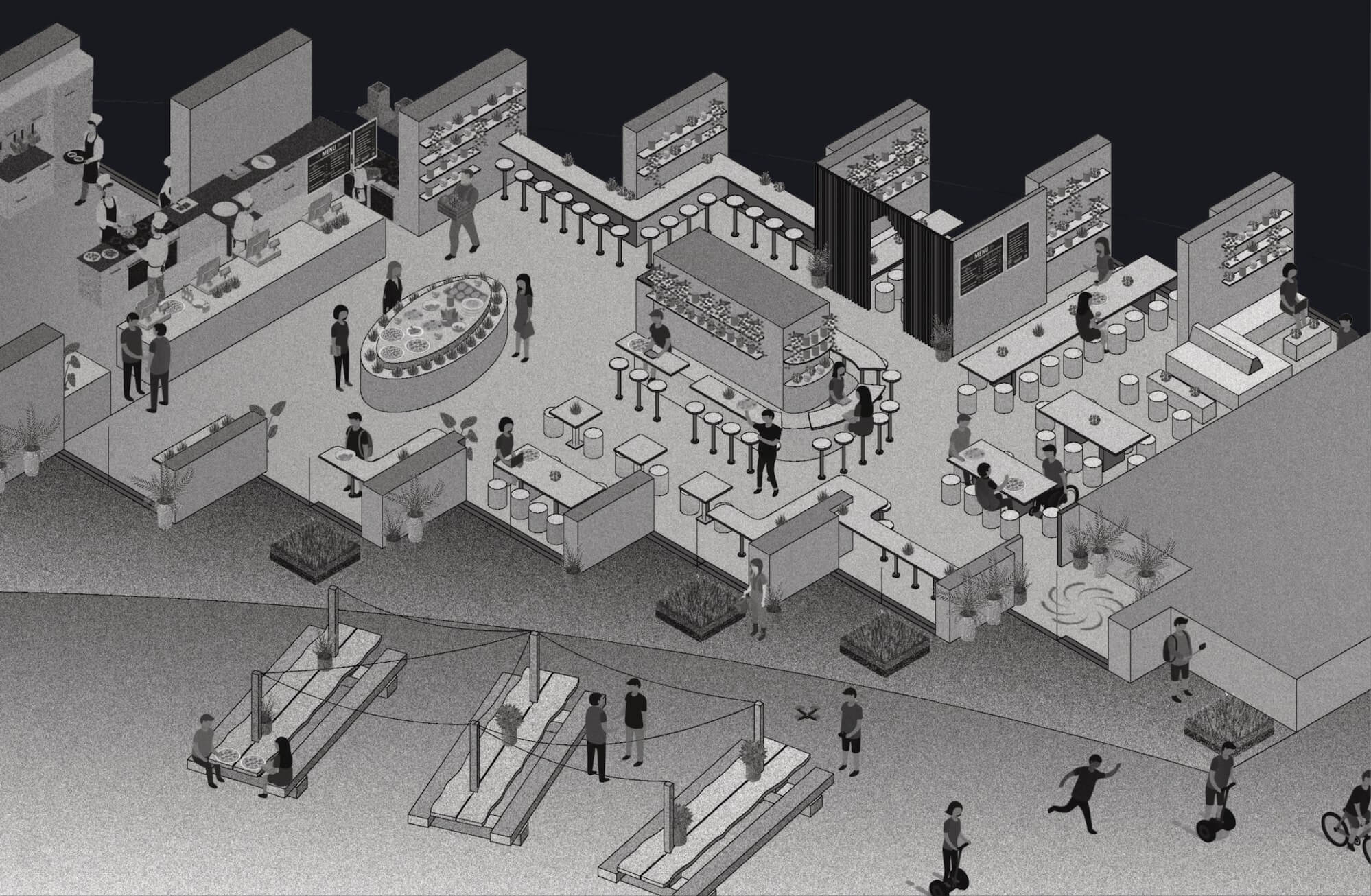
Hospitality Architecture distribution
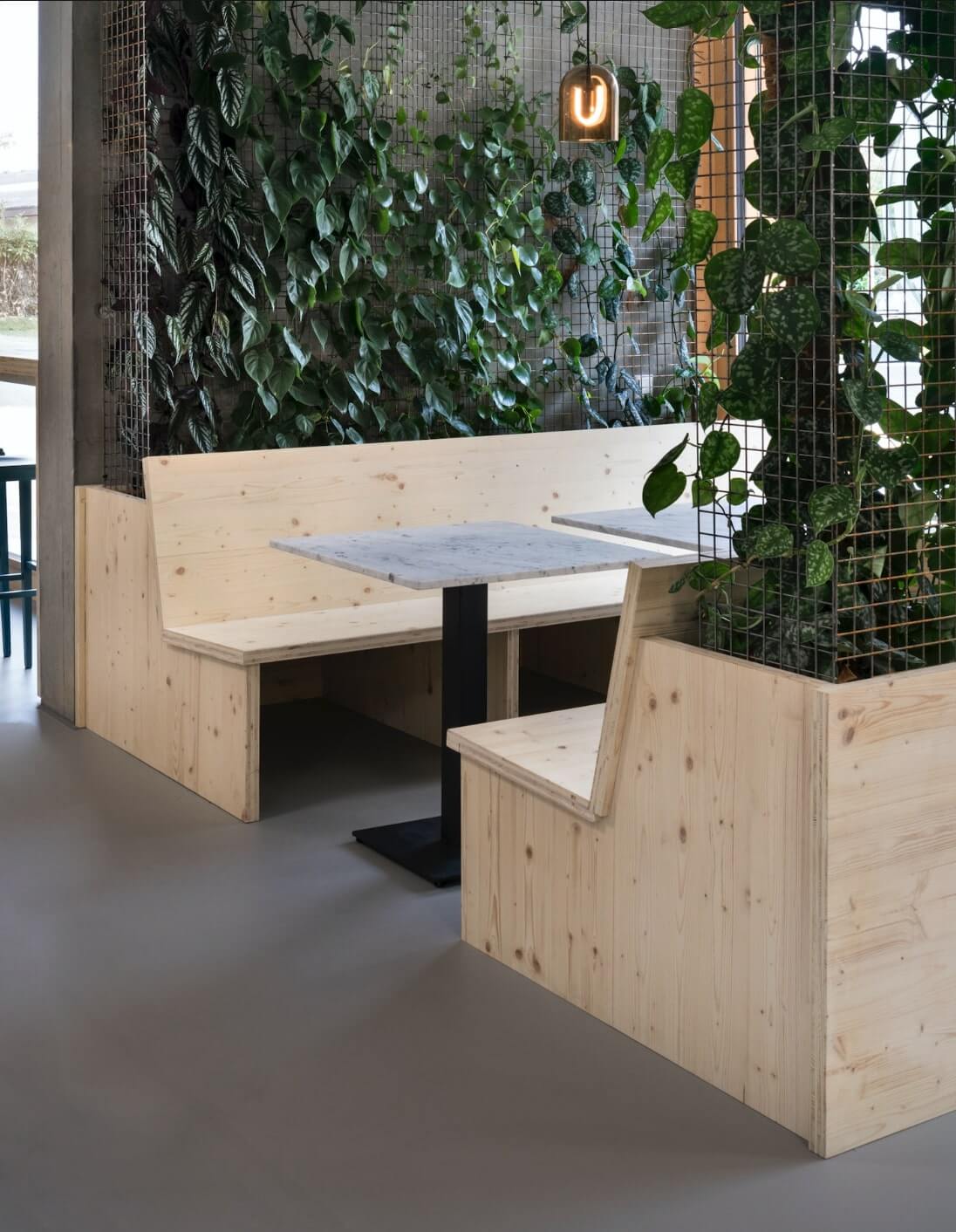
The architecture floor plan of the restaurant has several complexities to deal with. Wall and windows are serrately distributed, creating intricate spaces. There is a huge technical duct in front of the entrance and in the middle of the restaurant. Interior design solved the distribution of the restaurant by taking advantage of the technical duct. Designing a huge “U” shaped bench around it by pushing the tables and counters against the walls or windows liberating the needed space for a comfortable circulation. Now, the duct seamlessly disappears in the interior design.
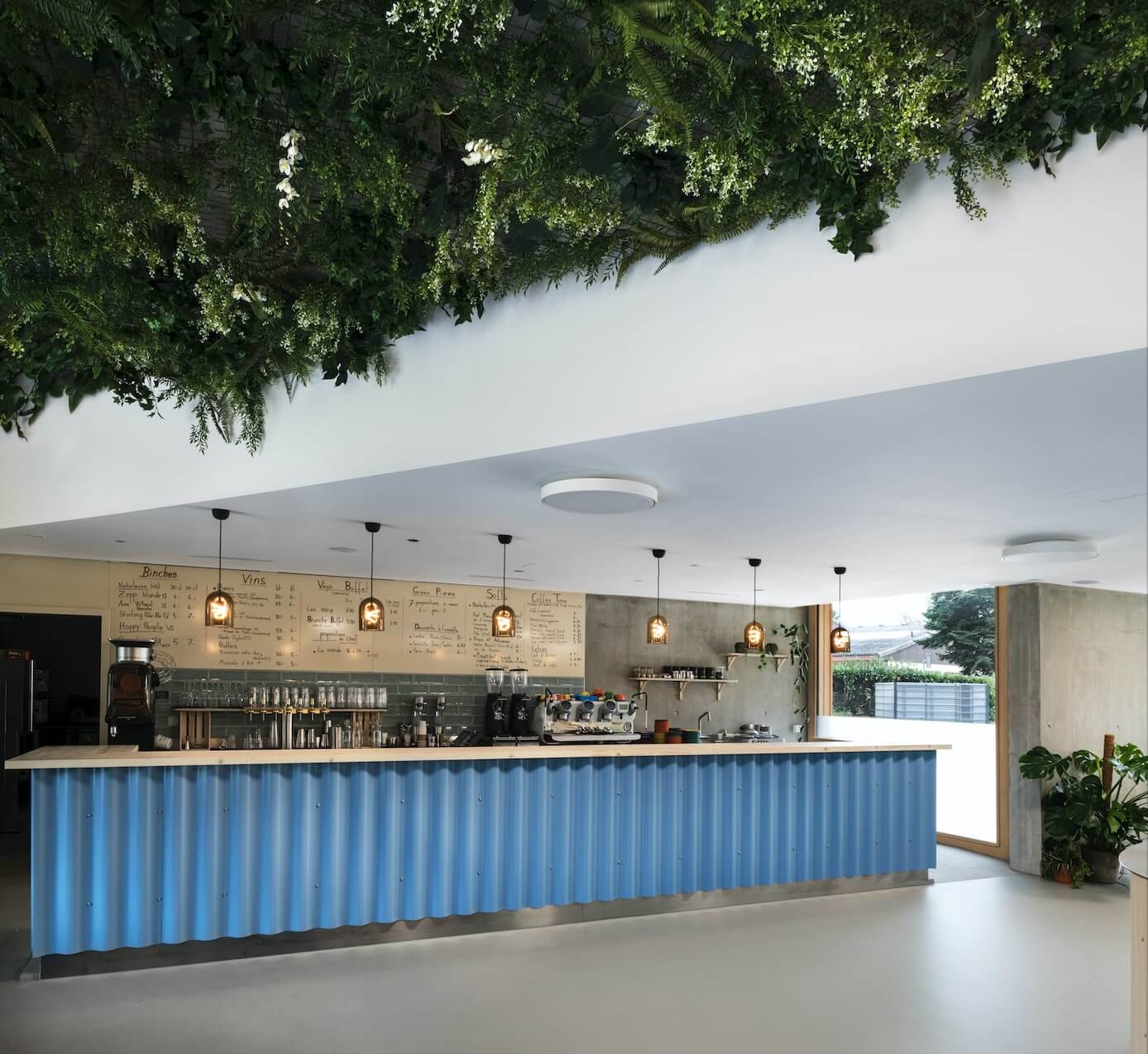
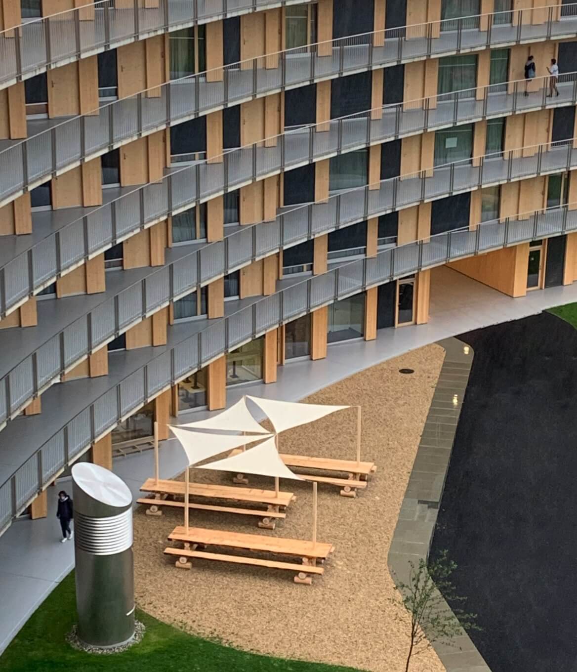
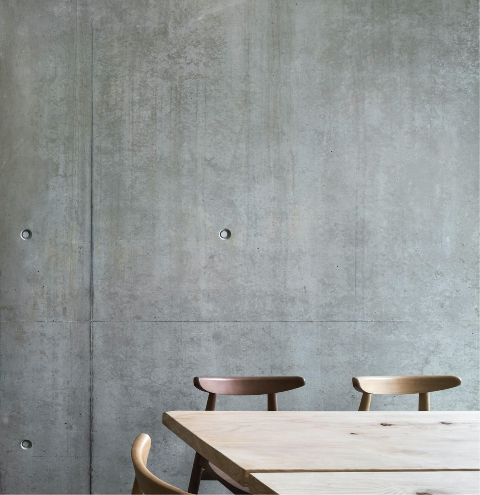

a green plants Architecture table design for a restaurant
Even the stools participate to the architectural language. If the stools use as a base material solid wood, each group has its own identity. The central stools are quilted and display a ruff but delicate fabric. The other stools are dark blue.
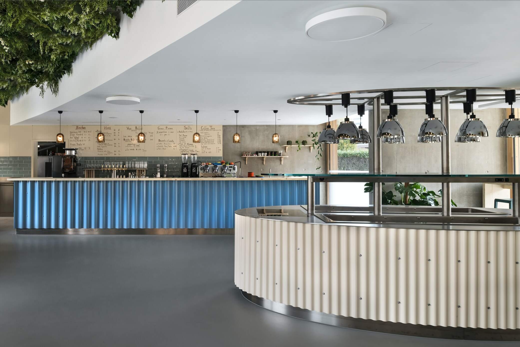
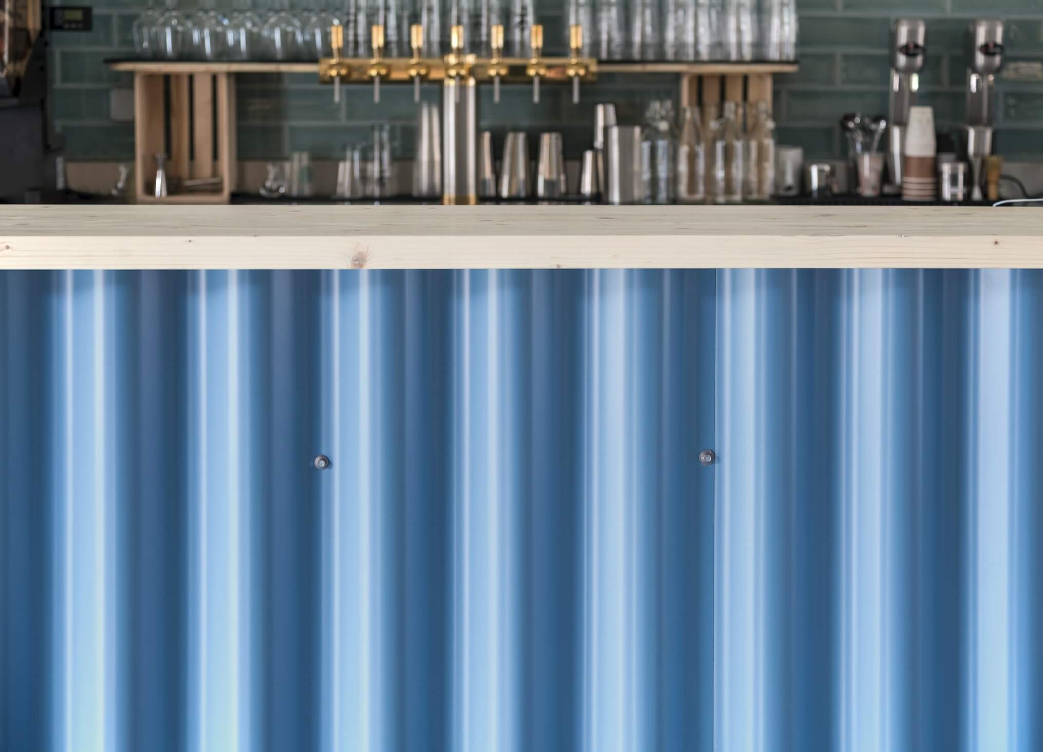
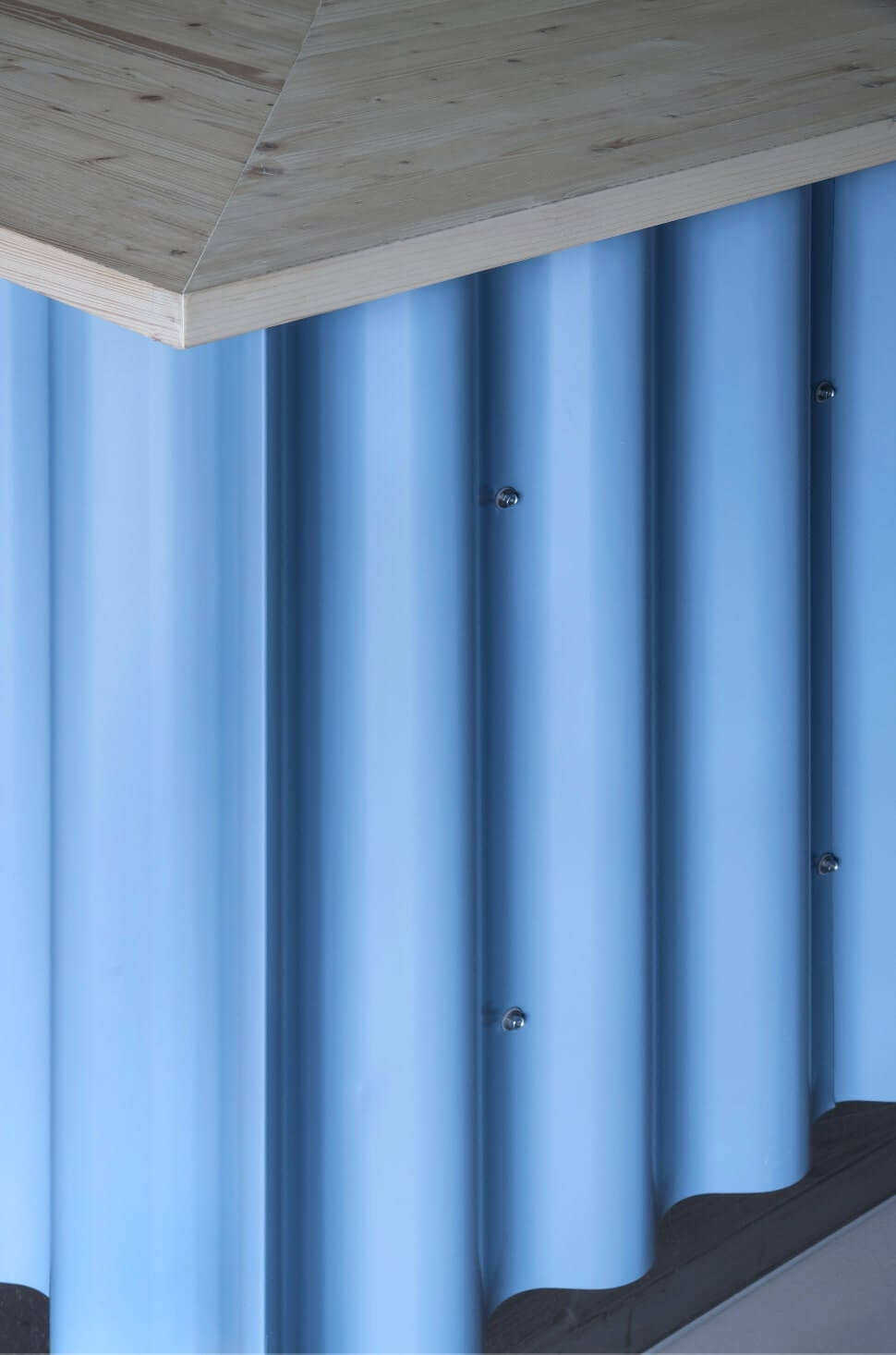
The bar and the metallic school chairs display a light blue to counterbalance the omnipresence of green leaves. Corrugated iron on the buffet recalls the industrial activity of mankind. Instead of taking position against the green plants the two identities merge into one. Addressing the contemporary dilemma of green future of architecture and green interior design. Each counter showcases a different color and scale of corrugated iron. Hereby their identity is heightened.
Real white stone tables stand awaiting for chattering crowds of hungry students. The alcove which is embraced by natural plants feature Carrara Marble tables. The Tree table are square shaped. In front of the self-service counter another half-dozen of Carrara Marble tables are flanked by classic schools chairs. If you look closer these are not the classical school chairs. Their form and color are sensitively adapted the overall architectural intention.
